
It’s Easy to be Fooled by a Climate Alarmist
Dispelling the fallacies of a solar company owner
![]()
Gregory Wrightstone — March 6, 2020
Author of Inconvenient Facts — The science that Al Gore doesn’t want you to know
An article highly critical of my book Inconvenient Facts, a bestseller, has received wide distribution. It’s Easy to be Tricked by a Climate Denier purports to be a factual take-down of the book and, by extension, of me. However, it is really just one more example of how proponents of catastrophic man-made warming need to resort to lies and distortion in order to advance their agenda.
The author, Willard MacDonald, is not a scientist but the Vice President of Vivint Solar, a solar panel manufacturer and installer. No conflict of interest there! He does have degrees in computer science and electrical engineering, documenting an education appropriate to his line of work but not applicable whatsoever to discerning the complexities of climate or the long-term records of temperature and carbon dioxide.
In reference to my book’s 60 inconvenient facts, MacDonald states right up front that “most of them are true” and that they are also non-controversial statements. However, he disputes the conclusions drawn from them. He asserts that “every page of [the] book includes incorrect or misleading interpretations of data or science.”
What MacDonald objects to is not so much incorrect data or charts, but how the book tends to view the data by placing them in the long-term geologic perspective without resorting to alarmist interpretations. That is the crux of the entire hit piece — not that the book provides incorrect science, just that it doesn’t “toe the company line” and advance the so-called “consensus” opinion of catastrophic man-made warming.
MacDonald admits that “Wrightstone does include ‘some’ peer-reviewed references.” If “some” means 17 pages of sources and more than 130 separate peer-reviewed references, then I suppose he would be correct.
A recurring theme is that Inconvenient Facts “cherry-picks” data in order to support assertions that are in opposition to man-made catastrophic warming. Yet, no documented examples of so-called “cherry picking” are provided.
From the article:
“Wrightstone presents a number of true facts to build credibility and trust on a topic, and then from those true facts deduces an incorrect conclusion. The casual reader can easily overlook the misdirection. Climate science is complicated, and most readers are not equipped with the background or the time to investigate claims that, when written with authority, sound truthful.”
In essence, MacDonald is telling you that you are too stupid and unqualified to make a judgment on your own. Please ignore the well-credentialed and degreed scientist (Wrightstone) with his highly qualified sources, and rely on me (MacDonald), a self-described “solar entrepreneur,” to provide the truth about this complicated subject.
In his purported exposé of the supposed fallacies within Inconvenient Facts, MacDonald lists seven basic high-level “myths.” Here, we will examine each of these so-called myths related to Catastrophic Anthropogenic Global Warming (CAGW) and find out that the facts are not quite as our solar entrepreneur asserts.
Myth 1 — Since the history of the earth includes periods of significantly higher CO2 and temperature, we shouldn’t worry.
As a geologist, one of my main goals within Inconvenient Facts was to place our current climate conditions into the long-term geologic perspective, rather than comparing it to short-term trends dating back hundreds or even thousands of years, as is common. This longer viewpoint was a central over-arching theme and was my stated goal in creating Inconvenient Facts:
“As a geoscientist who has dealt with various aspects of the Earth’s processes for more than 35 years, I know that the brief hundred or so years of recorded temperatures — and the even shorter time frame since the first satellite was launched — is just a blink of a geologic eye. It is too brief a period to evaluate the data adequately. Much of climate science deals with the few decades of recorded data available and does not attempt to place this data in the longer geologic perspective needed to analyze it adequately.”
Here, we will review how temperature and carbon dioxide are analyzed within Inconvenient Facts and why Mr. MacDonald’s distaste for the big picture is just not correct.
Carbon Dioxide
According to MacDonald, carbon dioxide (CO2) and temperature data on a geologic scale are not relevant to any discussion concerning our changing climate. Only data since man appeared on Earth should be included and pertinent.
First, we will look at carbon dioxide changes through geologic history. Then we will review his objections to long-term temperature. He states:
“the fact that CO2 levels were higher millions of years ago is irrelevant to whether people living today will be negatively impacted by recent high levels.”
Let us first dispel any notion that projected higher levels of CO2 will have a direct deleterious impact on humans. As of early 2020, atmospheric CO2 concentration was about 415 parts-per-million (ppm). According to the National Oceanographic and Atmospheric Administration (NOAA), CO2 levels may reach 900 ppm by 2100, which is well below the minimum threshold for negative impact to humans. The United States Department of Agriculture has set a maximum exposure limit for workers at 5,000 ppm and states that even at levels of 10,000 ppm there are typically no ill effects.
Proponents of man-made catastrophic warming claim that the increase in carbon dioxide concentration from 280 parts per million (ppm) during the early stages of the Industrial Revolution in the mid-1700s to more than 400 ppm today is an alarming increase. According to this viewpoint, this ~130-ppm increase will surely lead to the many disasters foretold by the IPCC and other groups promoting the “consensus” on the catastrophic consequences of our changing climate.
The recent rise in CO2 does appear to be a remarkable increase when viewed in the context of our current Pleistocene epoch dating back to the beginning of our current spate of glacial advances and retreats. The illustration below (Figure 1) shows levels going back 400,000 years along with what appears to be a remarkable increase in the last century.
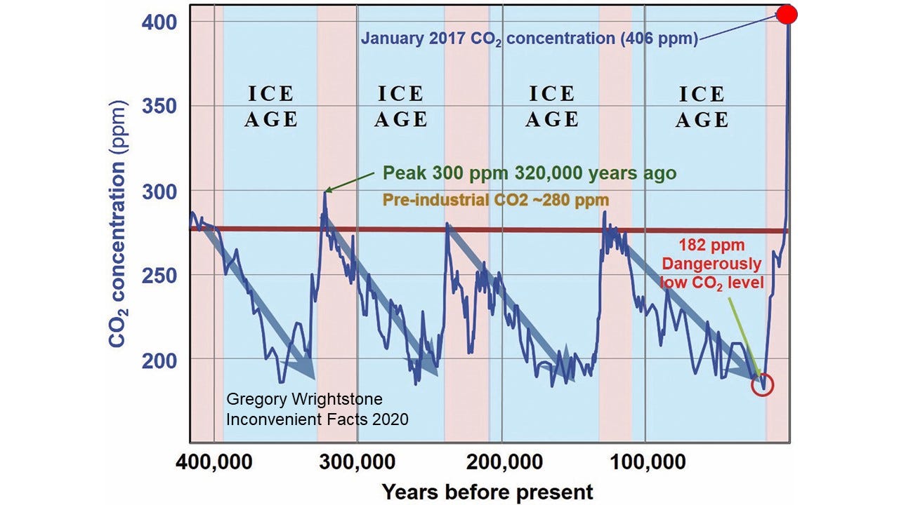
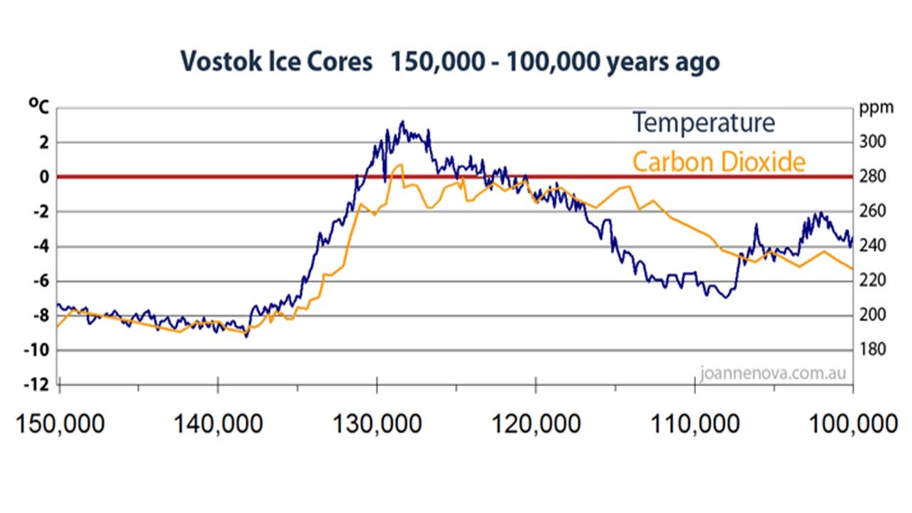
A closer look at the data (Figure 2) and comparing it to temperature shows that the variations in CO2 levels were temperature driven. In other words, the temperature changed first and then CO2 followed it. The warming of the interglacial periods such as the one we are in right now caused CO2 atmospheric levels to increase because warm oceans expel the gas. The cold of the glacial advances caused the seas to absorb the life-giving molecule and lessen the concentration in the atmosphere.
For more than 800,000 years, temperature has driven CO2 levels, but Mr. MacDonald would have us believe that all changed sometime in the mid-20th century. This is a primary reason that he and his fellow alarmists don’t want the longer-term geologic record revealed.
Placing this data into an even longer geologic picture (Figure 3) provides an eye-opening perspective to the modern 130-ppm increase. It reveals that the Earth has been in a 140 million-year dangerous decline in carbon dioxide. The decrease from 2,500 ppm to the dangerously low level of less than 180 ppm at the end of the last ice age put the Earth perilously close to a true climate apocalypse. Why would such a low level be dangerous? It is because it came terrifyingly close to the minimum threshold for most plant life to exist at about 150 ppm. Had that line-of-death been crossed, it would have resulted in a true climate apocalypse.
Viewed in this perspective, it becomes obvious that our recent increase of 130 ppm is exceedingly small and barely registers as a blip on the chart of Earth’s CO2 history.

Temperature
When viewing temperature, nearly all proponents of CAGW look at only the most recent several decades of data to “confirm” their notion of a CO2-driven dangerous warming. According to MacDonald:
“the fact that it was significantly warmer before mammals existed on earth is irrelevant to whether global warming is or is not detrimental for our modern civilization.”
It is certainly “convenient” to only view the most recent several decades of temperature data, the reason being that during the last 150 or so years both CO2 concentration and temperature have increased. And so, the alarmists say there is clearly a correlation between rising CO2 and rising temperature. Not so fast. Correlation is NOT causation.
No, Mr. MacDonald, it is not only appropriate to look at the recent data in the longer perspective, it is vital and necessary. We will look at three temperature charts in order to confirm the value of a long-term geologic perspective. The first (Figure 4) is a chart often used by proponents of man-made warming to support their contention of a link between the rise of CO2 and increasing recent temperature. It charts the recent temperature and CO2 data going back to the year 1850 with an apparent correlation between the two.

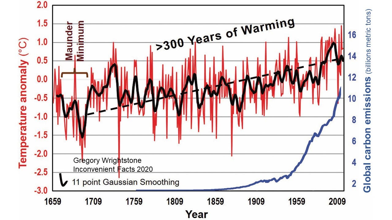
A bit longer perspective (Figure 5) shows the longest available thermometer record dating to 1659 that reveals that our current warming trend began more than 300 years ago, and the supposed correlation disappears. Importantly, it shows that the Current Warming Period began long before any significant increase in human emissions could have caused any warming.
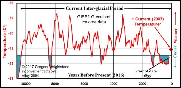
Our last chart on temperature (Figure 6) shows 10,000 years of temperature fluctuations with a gradual decrease in temperature over the last 6,000 years and that the Current Warm Period is likely nothing more than another cycle of warming very similar to the nine previous cycles that were all 100% naturally driven. Another common talking point is that the rate of warming is also unprecedented, yet five of the nine other warming trends had higher rates of warming.
Human carbon dioxide (CO2) emissions began ramping up in earnest in the post-World War II era of the mid-twentieth century. If the temperature increases over the last 70 or so years were historically unusual and unprecedented over the scale of thousands and millions of years, then that would be strong evidence that man’s increase in CO2 is the primary driver of that temperature change. On the other hand, if scientific and historical records confirm that our recent temperature changes are very similar to those of previous periods, it would be supportive of those who say that our modern changes are nothing more than a continuation of natural cycles of warm and cold are probably correct. This last chart on temperature (Figure 6) does just that.
Unprecedented? Unusual? No and no.
Myth 2 — Global warming is not due to CO2 or Humans
Mr. MacDonald’s primary objection in this regard is the fact that Inconvenient Facts used “cherry-picked” data to support an allegation of a “pause” in global warming in the decade-plus record in the years immediately following 1998. The chart in question can be found on page 31 in the book (Figure 7, below) and shows that global surface temperatures ceased increasing for 14 years even though carbon dioxide concentrations continued increasing.

This chart used a truncated portion of a global temperature history of surface and ocean gauges known as the HadCRUT4 data set. (HadCRUT stands for Hadley Climate Research Unit at the University of East Anglia). The time frame selected was to show a fourteen-year-plus period in recent data that revealed that, although CO2 continued increasing, temperature did not.
According to MacDonald the data was “cherry picked” and omitted the years in 2015 and 2016 when there was an uptick in temperature:
“the logical explanation for why he omitted it appears to be because the data clearly returns to an upward warming trend just like the 20 years before 1998, and this didn’t support his facts.”
No attempt was made to “hide” the 2015/2016 data or the increase in temperature in those years as claimed, as the full data set available at the time of publication is presented on three other illustrations within the covers of Inconvenient Facts, including one on the facing page (page 30). I also referred to that very same rise in 2015–16 that MacDonald says that I ignored by stating, “Based on the most recent data and confirmed by examination of satellite data, the Inconvenient Pause may have ended in 2015.”
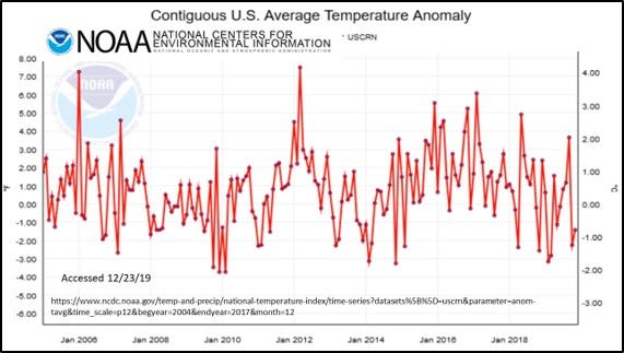
Further support of the “pause” after 1998 comes from the U.S. Climate Reference Network (USCRN), which was created in 2005 as a network of 114 land-based temperature measuring stations across the United States. This network was created in order to have a pristine data set that was free from any biases including the urban heat island effect and has had no “adjustment” of the data, as have most of the other data sets. The USCRN data (Figure 8) show that there has been no warming for nineteen years across the United States, dating to inception of data gathering.
The second problem identified under this “myth” is the use of the Central England Temperature Record (see Figure 5, above). MacDonald does not approve of displaying this because it is not global, and it begins during a cold period.
“this data is not for the world, the northern hemisphere, or even Europe — just for local England…”
“Second, the data set happens to start with a period known as the “Maunder Minimum,” around 1700, a very cold period coinciding with what’s known as the “Little Ice Age.” The Little Ice Age was caused by volcanoes triggering a feedback loop in sea ice plus natural lows in solar radiation.”
The data set was used because it is the longest record of instrument data available (1659) and predates the HadCRUT4 data (figure 5) above by nearly 200 years. The Central England Temperature record is from a geographically small area but uses three sets of records bounded more or less by London, Bristol and Lancashire. While geographically small it has been said to be representative of a much larger area, and according to Dr. Mike Hulme “it is well correlated with land temperatures over the entire Northern Hemisphere (Hulme 1997).”
By pointing out that the data begins in the middle of the cold period known as the Little Ice Age and admitting that the warming began 300+ years ago due to natural forces, MacDonald unknowingly supports one of the biggest themes that runs throughout the book. The recurring thesis within Inconvenient Facts is one of cyclic natural forces forcing large temperature swings through time. These naturally driven cycles of warm and cold reinforce the notion that our current warming trend is simply a continuation of those cycles. Those natural drivers did not end in the middle of the 20th century.
Myth 3 — Rising sea levels are not due to CO2 or humans
The majority of the critique by MacDonald was well-constructed and written (incorrect and misleading, but well-constructed). This particular section was a confused mishmash which unintentionally validated my position on sea level rise. He agreed that natural forces are likely the primary control of current sea level rise and that it is not accelerating at alarming rates. As if to underscore this, he writes:
“As global temperatures naturally recovered from the Little Ice Age, the glaciers naturally receded.”
He also has a particular issue with the sea level graph used within Inconvenient Facts (Figure 9 below) from Jevrejeva (2008).
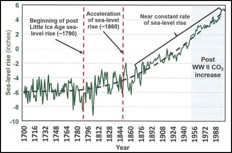
One claim is that I “cherry-picked” data and that the chart above only showed data to 2000, when additional data was available through 2010. The dates at the bottom are only labeled every 16 years for chart clarity. The actual data used for Figure 7 extend through 2002, which is the most recent data reviewed by the researcher for this paper.
The author returns again and again to his claim that there was natural warming before the 20th century, but that has all changed in the not-too-distant past:
“… sea level rise in the 1800s was due to the same warming trend following the Little Ice Age … In this case, there was natural warming before the 1900’s, and then human CO2 emission causing warming in the 1900’s and beyond …”
So, according to our solar entrepreneur, natural warming has been driving sea level rise and fall since the dawn of time, but all that remarkably changed with the advent of the Model T. He does accurately quote Dr. Jevrejeva in saying, “…sea level acceleration up to the present has been about 0.01 mm/yr and appears to have started at the end of the 18th century.”
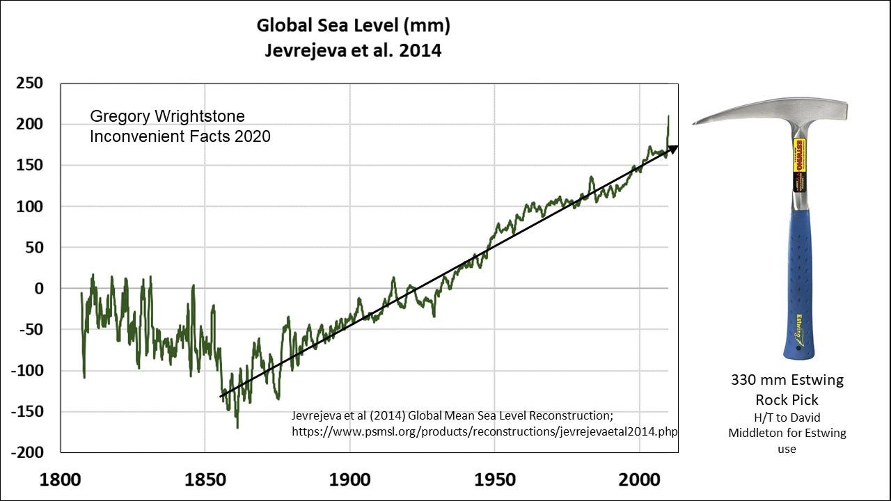
In hindsight, a better and more recent study by the same author (Jevrejeva 2014 — Figure 10) used more data points (1,277 records) for a clearer look at sea level since 1807. This reveals that MacDonald’s breathless reporting of a possible dangerous rise in sea level of 340 mm by the year 2100 may not be quite so catastrophic. When compared to my trusty Estwing rock hammer, that rise doesn’t appear quite so dangerous and likely easily mitigated by forward-thinking nations and communities.
One final response to unfounded sea level claims made by our friend in his critique of Inconvenient Facts. MacDonald stated:
“It is estimated that population displacement due to climate change will be 200 million to 1 billion people by 2050.”
With no reference or source to this claim provided, we could review what the United Nations has had to say in the past on similar claims. A report for the United Nations’ Environment Program in 2005 asserted that there would be 50 million climate refugees by 2010, many of them driven out of their coastal homes by sea-level rise.
The UN even provided a handy identifier map which included the areas of highest risk: low-lying islands of the Pacific and Caribbean and commented that “some will disappear completely.” Review of the most recent census of these islands shows that the populations have blossomed, so, rather than fleeing these islands, people are flocking to them as the tropical paradises they are.
One of those “at risk” island nations is the Maldives, where three new resort hotels are being constructed along with a new airport. This new Maldives construction has been completely financed and insured by companies that avoid risk like the plague. These companies have assessed the risk and are betting against the UN with hundreds of millions of dollars of their own capital.
Undeterred by facts or common sense, the UN predicted in 2015 the same 50 million climate refugees by the updated timeline of 2020. Please be patient, the UN’s updated climate refugee deadline will be released soon and I am sure that they will get it correct this time.
Myth 4 — Global warming is not a problem, in fact it is good
In this section our solar panel installer presents multiple factually incorrect statements concerning what is represented in the book and about the many benefits of modest warming and increasing CO2. Here we will present his statement and then the facts.
“The author poses an interesting idea: the next ice age is coming, so we should allow the earth to warm in order to counteract it. It is true that there is a next ice age coming, and so this is an intriguing idea…until you learn that the next ice age is, at the soonest, 2000 years away!”
Yes, indeed another ice age is coming. I never presented the idea that we should allow the Earth to warm in order to prevent it. However, I DO quote a statement that can be found on the United States Geologic Survey’s own website concerning the next ice age that stated “It is somewhat ironic that our contribution of greenhouse gases to the atmosphere may actually be helping to delay the next ice age from starting!”
My Inconvenient Fact #15 stated “Interglacials usually last 10,000–15,000 years. Ours is 11,000 years old.” As to when the next ice age will descend upon us, the fact of the matter is that no one really knows. It may be the 2,000 years referenced, it may be in 200 years and it may have already begun, and we just don’t know it yet. Whenever it does begin, one thing is certain, it will be horrific.
Another fact-free statement from MacDonald:
“…global warming is going to hurt food production, not help it, due to worsening droughts and increased temperature.”
“The impacts of increased global warming are widely understood among the scientific community to include: more extreme weather events, increased coastal flooding, reduced access to clean water, reduced crop yields, increased fires, more disease, resource wars, and more.”
The amount of misinformation in these two sentences is quite extraordinary. The supposed catastrophic consequence of the presumed man-made warming listed are simply unfounded speculation on what may or may not occur 50 or 80 years into the future based on failed climate models.
I live in the real world and draw on what is happening today and the recent past in order to project what we may see in the future. What we find is the following:
· Food production is increasing and breaking records year-after-year.
· Droughts are in long-term decline.
· Extreme weather deaths are in significant long-term decline.
· Our water and air are cleaner today than in 100 years and continue to improve.
· Fires are decreasing globally.
The debunking of the increasing number and severity of severe weather events will be dealt with in a later section on that subject.
Since Easy to be Tricked admits that our rising CO2 concentration is increasing plant and crop growth today, I won’t bore you with the voluminous studies related to the matter. I do strongly recommend the CO2 Science Plant Growth Database that is managed by Dr. Craig Idso and his team of scientists to learn more about how increases of this miracle molecule benefit plant growth.
One line of thinking used often by alarmists such as Mr. MacDonald is that, while crops will increase yields and growth (it is hard to dispute this fact), the nutritional value will be decreased. According to one of the most widely quoted studies (Beach 2019), wheat, rice, maize, barley, potatoes, soybeans, and vegetables are all projected to suffer nutrient losses of about 3% on average by 2050 due to elevated CO2 concentration. This is due to projected losses in protein, iron, and zinc.
According to Craig Idso (2013), the relatively tiny amounts of speculated nutrient reductions are overwhelmed by an average increase of 46% of crop biomass owing to increased CO2 fertilization effect. Please note that protein losses are most likely due to lower levels of nitrogen available and that all of these alleged reductions can be easily resolved by continuing or increasing the practice of that radical new agricultural technology: fertilization.
On top of CO2 turbo-charged plant growth, crops are benefiting from the warming by an extended growing season (Figure 11). Killing frosts end earlier in the spring and begin later in the autumn, leading to additional plantings and reduced crop loss.

An important but overlooked factor concerning the fires and droughts is the increasing soil moisture that alleviates both of these. A warming ocean leads to increased evaporation and, hence, to increases in precipitation. That, combined with lessened water needs by plants owing to enhanced CO2 fertilization, is leading to a worldwide increase in soil moisture, and that is a good thing for ecosystems and humanity.
Myth 5 — Scientists don’t agree that global warming is man-made
The Easy to be Tricked critique falls back on the tired 97% “consensus” opinion for Myth #5. That alleged “consensus opinion” is that the 0.8 degree C warming measured over the last 120 years is caused by human emissions of greenhouse gases (mostly CO2).
I agree that there is likely a near 100% agreement on the following:
· Carbon dioxide concentration has been increasing in recent years.
· Temperatures have been generally increasing in fits and starts
We saw in previous sections that the Current Warming Period began more than 300 years ago. Even Mr. MacDonald agrees that the first 200 or so years of that modern warming were driven entirely by natural forces. The fact of the matter is that those forces did not stop functioning in 1950 and are actively affecting temperatures today just as they have since the dawn of time.
I don’t dispute that increasing CO2 has a warming effect on the atmosphere since it is a greenhouse gas. What is impossible to quantify is the actual percentage of warming that is attributable to increased anthropogenic (human-caused) CO2. There is no scientific evidence or method that can determine how much of the warming we’ve had since 1900 was directly caused by us and how much can be assigned to the continuing natural drivers of climate.
The long and hard road to scientific truth cannot be followed by the trivial expedient of a mere headcount among those who make their livings from government funding. Therefore, the mere fact that climate activists find themselves so often appealing to “consensus” is a red flag. They are far less sure of the supposed scientific truths to which they cling than they would like us to believe. “Consensus,” here, is a crutch for lame science.
The primary paper that is often trotted out in support of the notion of “97% consensus” was written by John Cook. Published in 2013, it is the most widely referenced work on the subject of climate consensus and has been downloaded more than 600,000 times. Of note, the project was self-described as “a ‘citizen science’ project by volunteers contributing to the website.” The team consisted of two dozen climate activists who did not leave their climate prejudices at home. Nor were they in any way qualified to be part of this type of what claimed to be a peer-reviewed paper.
Cook and his team of 24 volunteers who were recruited from his website reviewed abstracts from 11,944 peer-reviewed papers related to climate change or global warming, published over the 21 years 1991–2011. Their stated goal was to assess the extent to which the papers supported the “consensus view” on climate change. They concluded that “97.1% endorsed the scientific consensus on AGW.”
One gargantuan error in the Cook paper (Cook 2013) was the categories used to determine if an author agreed with the consensus. Only the first category amounted to an explicit statement that humans are the primary cause of recent warming. The second and third categories would include most skeptics of catastrophic anthropogenic warming, including me, who accept that increasing CO2 is probably causing some, probably small, amount of warming; an amount that is likely rendered insignificant by natural causes of warmer weather.
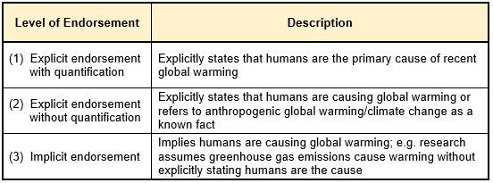
In rebutting this paper, I cited another peer-reviewed paper whose primary author was noted climatologist Dr. David Legates (Legates 2013). Dr. Legates reviewed those same 11,944 papers and found that 7,930 of the papers took no position at all on the subject and were arbitrarily excluded from the count on this ground. If we simply add back all of the papers reviewed, the 97% claimed by Cook and his co-authors falls to 32.6%.
Quoting from Inconvenient Facts concerning the Legates study:
“They reviewed the actual papers used by Cook and found that only 0.3% of the 11,944 abstracts and 1.6% of the smaller sample that excluded those papers expressing no opinion endorsed man-made global warming as they defined it. Remarkably, they found that Cook and his assistants had themselves marked only 64 papers — or 0.5% of the 11,944 they said they had reviewed — as explicitly stating that recent warming was mostly man-made. Yet they stated, both in the paper itself and subsequently, that they had found a “97% consensus” explicitly stating that recent warming was mostly man-made.”
MacDonald had a big problem with using the entire nearly 12,000 papers rather than the 4,014 papers that explicitly stated one way or the other that climate change was primarily caused by human CO2 emissions:
“This is not a valid way to tally opinions. If you are trying to report the number of people who have opinion A vs opinion B, you take the total number who have opinion A and divide it by the total number that stated either opinion A or B. If there was no opinion stated, then it is not part of the statistic.”
I will cede this argument to the non-scientist MacDonald as having a valid point. If we ONLY look at the smaller number of papers that either agree or disagree with the consensus, then the number agreeing with the consensus is still very tiny at 1.6%, which is nowhere near the 97% claimed.
A second detailed review of Cook’s methodologies was completed in 2014 by Dr. Richard Tol, professor at the University of Sussex. Dr. Tol agrees that the overwhelming majority of literature on the subject agrees with the consensus but argues that Cook’s methodologies were flawed.
This is how Dr. Tol described the deficiencies in Cook 2013:
“Reported results are inconsistent and biased. The sample is not representative and contains many irrelevant papers. Overall, data quality is low. Cook’s validation test shows that the data are invalid. Data disclosure is incomplete so that key results cannot be reproduced or tested.”
And:
“…they gave further cause to those who believe that climate researchers are secretive (as data were held back) and incompetent (as the analysis is flawed).”
Science does not advance through consensus, and the claim of consensus has no place in any rational scientific debate. We ask: What does the data tell us? What does it mean? Can we reproduce the results? If climate alarmists need to resort to an obviously flawed consensus opinion, rather than argue the merits of the science, haven’t they already conceded that their argument cannot be won through open debate?
Perhaps the best statement on the subject was made by the late, great author Michael Crichton (not merely an author of fiction but also a Harvard-educated medical doctor whose scientific and technological achievements were widely recognized):
“Let’s be clear: the work of science has nothing whatever to do with consensus. Consensus is the business of politics. Science, on the contrary, requires only one investigator who happens to be right, which means that he or she has results that are verifiable by reference to the real world. In science consensus is irrelevant. What is relevant is reproducible results. The greatest scientists in history are great precisely because they broke with the consensus.
There is no such thing as consensus science. If it’s consensus, it isn’t science. If it’s science, it isn’t consensus. Period.”
Remember, you can’t spell consensus without “con.”
Myth 6 — Global Warming is not Creating More Extreme Weather Events
Panel installer MacDonald doesn’t like what Inconvenient Facts has to say about extreme weather:
“Not everything in Wrightstone’s book is wrong or misleading. He is correct that many people incorrectly tie too many extreme weather events directly to climate change. Scientists have not been able to create a clear case for connections between global warming and the frequency of hurricanes and tornadoes. There is, however, scientific evidence that the intensity of hurricanes is increasing due to increasing ocean temperatures caused by global warming.”
He pretty much gets this much correct. In my book I quote NOAA’s foremost hurricane expert Christopher Landsea, a meteorologist for the National Hurricane Center, who has quantified what an increase in the intensity of major hurricanes, driven by global warming, may mean (Landsea 2011). His work indicates that the warming over the last several decades translates into an increase in intensity of about 1%. For a Category 5 hurricane like Katrina, the wind speed would increase by 1 to 2 mph. He wrote: “The 1–2 mph change currently in the peak winds of strong hurricanes due to manmade global warming is so tiny that it is not measurable by our aircraft and satellite technologies available today, which are only accurate to about 10 mph (~15 kph) for major hurricanes.”
In other words, the estimated increase in hurricane strength is too small to be significant.
On the matter of heat waves, Mr. MacDonald has this to say:
“There is also a connection between global warming and increased heat waves and to some degree regional drought, both of which Wrightstone denies. For example, his “Inconvenient Fact 40” states “EPA: Heat waves are not becoming more frequent” (see: Wrightstone, 2017). However, the EPA (Environmental Protection Agency) study he refers to in his book is for the Southeastern United States, not the world.”
MacDonald here is blatantly misrepresenting material within Inconvenient Facts. I presented three illustrations related to heat waves and excessively high temperature and only one was regional in reach. That one local chart showed peak daily temperatures for the southeastern U.S. state of Alabama, was clearly labeled as such, and was used as an example of how local temperatures vary from strident media reporting. The two charts below, including the one from the EPA, address heat waves across the lower 48 states of the United States.
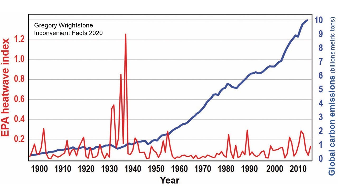
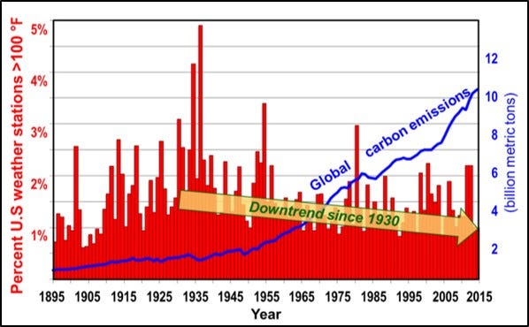
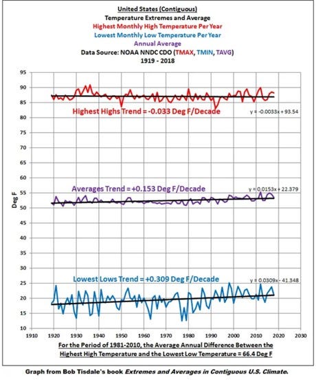
An interesting additional chart that was not included in my book is this gem derived from fellow geologist Bob Tisdale’s wonderful repository of charts gleaned from NOAA. In Extremes and Averages in Contiguous U.S. Climate: Graphs of 100 Years of NOAA Contiguous U.S. Climate Data, Tisdale presented a chart showing that the highest monthly temperature of the United States had slightly declined in the period 1919 to 2018.
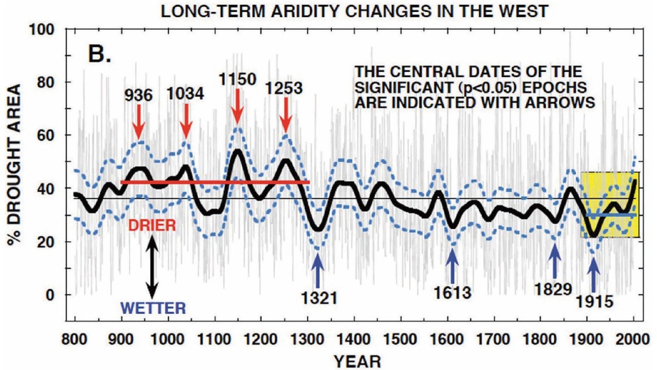
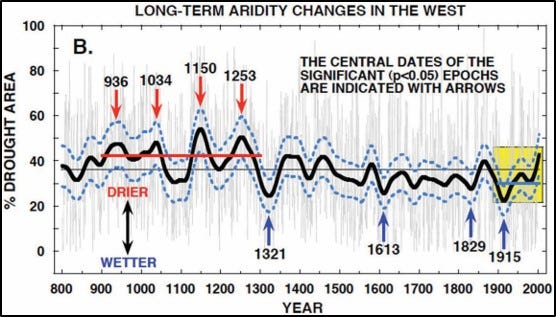
As for the claim that droughts were increasing and linked to climate change, no evidence was presented to contradict the six charts I provided documenting either no increase in drought (2) or a long-term decline (4). One of the most impactful of my charts was of the most severe and persistent droughts of the twentieth century (Figure 17) that documents a 60-year decrease in these devastating dry periods. Another was a much longer-term look at drought over 1,200 years in North America that reveals that the worst events occurred during the period 936 to 1253 AD (Figure 18).
MacDonald reserves most of his firepower in this section for his attack on my contention (backed up by science) of a global decline in the number of wildfires rather than the media-driven narrative of a planet beset by ever-increasing flame.
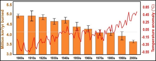
He presents my chart of the number of fires in the United States (Figure 20) that shows a nearly 80% decline in fires and then proceeds to do what he heavily criticized Inconvenient Facts of doing (falsely it turns out): cherry picking data to fit a narrative. He states:
“the last 30 years starts just after the dramatic cliff in his chart in 1986. If you plot just the 30 years from 1986 to 2016, the data looks like the chart below (Figure 19). When you fit a straight line to this data that starts in 1986 it does show a very slight decline, but it’s almost imperceptible to the average person looking at the data who would tend to say it looks more or less flat — certainly nothing like the visual impact when you compare it to the data prior to 1986.”
So, our friend’s solution to charts that don’t fit his narrative of “More CO2 = More Fires” is to delete the data that don’t conform and then graph the data that do.
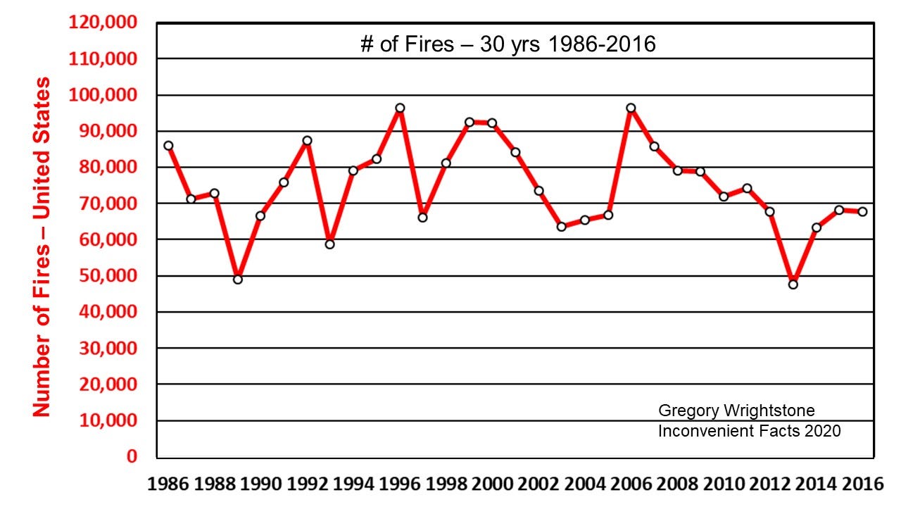
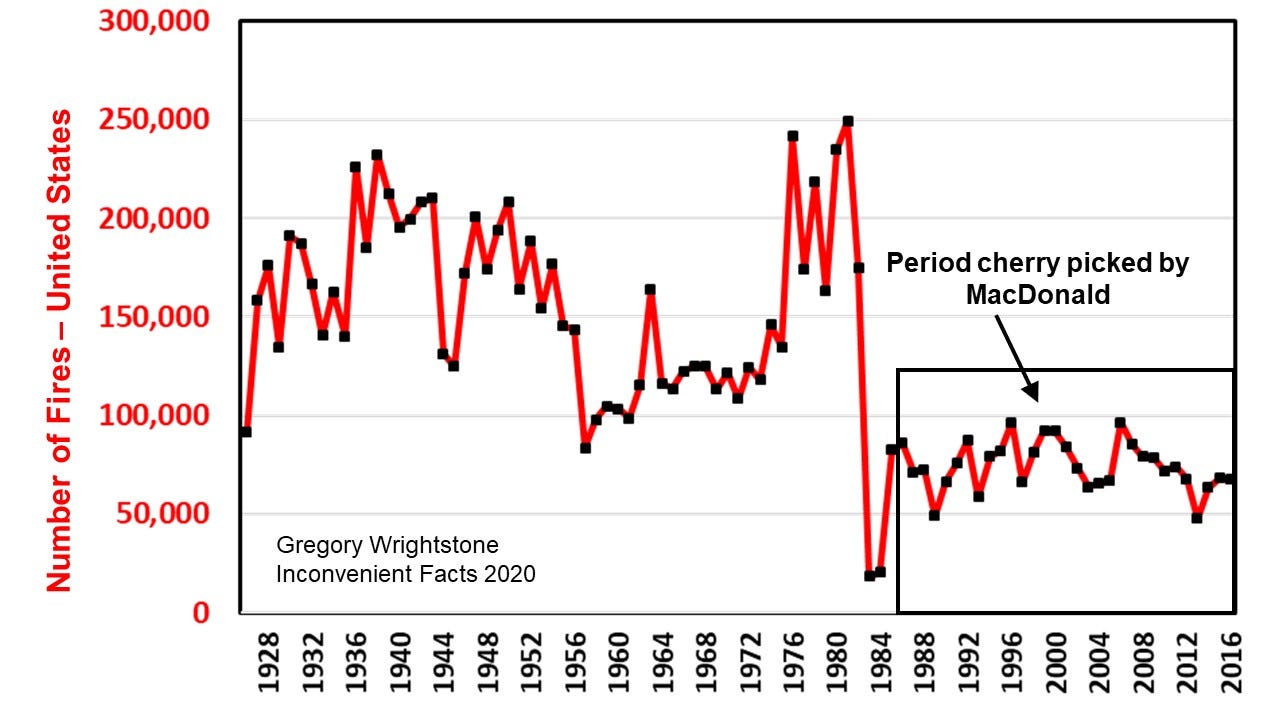
The charts shown above were derived from data accessed from the archives of the National Interagency Fire Center (NIFC). The NIFC states that data they present before 1983 is suspect. This is in much the same manner that NOAA warns against using late 19th and early 20th century numbers of tornadoes and hurricanes because they believe that these numbers were under-reported compared to today. It is likely that, before our modern reporting system, many fires went unreported, leading to an undercount in early years.
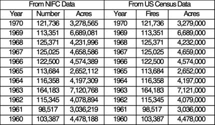
Subsequent to the publication of Inconvenient Facts, I discovered that the U.S. Census Bureau was responsible for cataloguing the number of fires and area burned during the period of 1928 to 1970. Inclusion of this earlier data allows us to chart data for an additional 40 or so years and confirms much higher fire numbers in the early 20th century and is presented below (Figure 21). Bear in mind that it is certainly likely that the chart under-reports this early data.
Confirmation of the validity of using both sources was made by noting the exact duplication between the Census data and the NIFC data during the period 1960 to 1970 as shown below:
MacDonald then digs an even deeper hole for himself by utilizing an even more egregious abuse of the “cherry picking” process by looking at only the most recent 32-year period for area burned in the United States, when nearly 90 years of data were available. By only reviewing the latest 30 years of data and then graphing it with a greatly expanded y-axis he charted what appears to be a large and alarming increase in the acres burned within the United States. According to him:
“It appears that while the number of fires has not increased recently, the size of the fires has increased dramatically. We really care about acres burned, not numbers, of fires.”
“In the chart of NIFC data above we see burned acres increased from around 2 million acres in 1984 to 7.5 million in 2016. This is a 275% increase.”
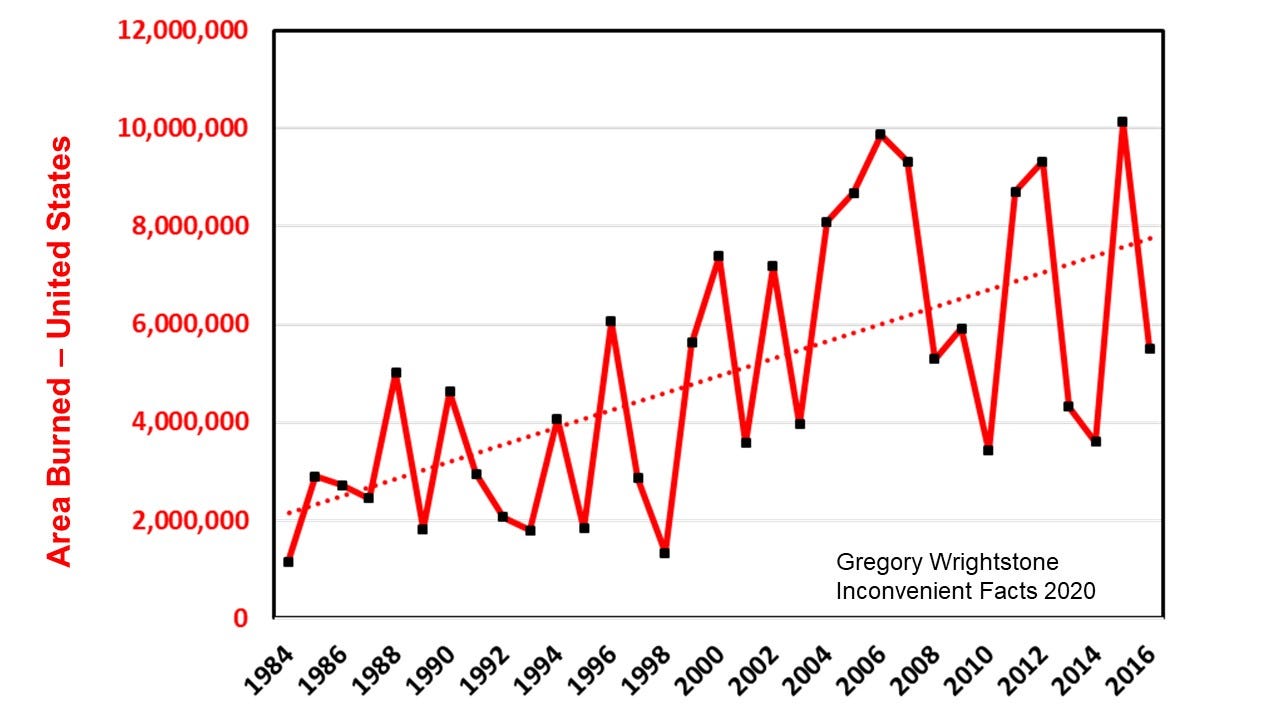
Placing the above chart into the full history of the data available (Figure 23) reveals quite a different story. The true and inconvenient revelation is that the area burned has also dramatically declined from more than 50 million acres to the current 6 to 10 million acres per year.
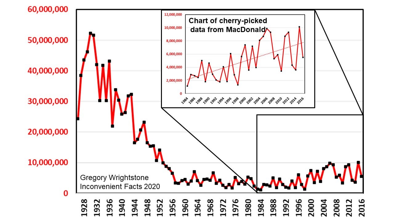
It is thought by experts in the field that the moderate increase over the last 30 years is a result of change in our forest management, rather than a result of our changing climate. According to the Sierra Nevada Conservancy (2017) “Overgrown, unhealthy forests are the underlying problem. Restoring our forested watersheds to a more resilient state offers the best protection for the future.” From their most recent publication:
· Today many Sierra forests host 300 or 400 trees per acre where there used to be 50 to 80.
· Overgrown and unhealthy forests provide optimum conditions for the spread of bark beetles.
· Fires that once revitalized forests are instead destroying them, resulting in massive amounts of dead trees.
Myth 7 — Ocean acidification is not a problem.
Once again, in attempting to refute the science within the pages of Inconvenient Facts, the author of Easy to be Tricked actually makes the case in support of its primary argument on so-called “ocean acidification.” The truth of the matter is that the oceans are NOT becoming acidic and WON’T become acidic except for a few isolated locations. According to MacDonald:
“Scientists are not concerned that the oceans will become acidic, becoming acidic means, by definition, a pH level below 7.0. Currently, the ocean has a pH level of around 8.1. “Becoming more acidic” just mean (sic) that it will drop, perhaps to 7.8. It is highly unlikely to drop below 7.0 any time soon.”
Thank you, Mr. MacDonald for stating what should be obvious: The ocean is firmly, consistently and historically alkaline (basic). Anything less than 7.0 on the pH scale is acidic and above that is alkaline. According to NOAA, the pH of the ocean’s surface waters has dropped from 8.21 to 8.10 since the start of the Industrial Revolution (NOAA 2020), hardly a dangerous decline and well within the natural variations that have been documented over several centuries of data.
The ocean’s pH varies depending on depth and geographic position and is generally slightly above 8.0 and is predicted by the IPCC’s own models to get all the way down to 7.92 pH by 2100, still quite alkaline and nowhere near acidic.
Any good climate change alarmist article on “ocean acidification” would not be complete without fact-free claims of pending oceanic disaster and MacDonald does not disappoint:
“Ocean acidification is happening, and it’s a serious threat to the coral, shellfish, and pteropods at the base of the oceans’ food chains and could lead to a collapse of the ocean ecosystem with serious consequences for humans that rely on food from the oceans.”
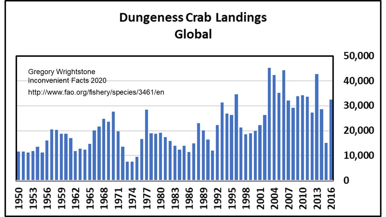
Or not. An example of the unfounded alarm described above was the recent reporting that rising acidity posed impending danger to Dungeness crabs. According to the Guardian, the “Pacific Ocean is becoming so acidic it is starting to dissolve the shells of a key species of crab.” A little research showed just how utterly false claims such as this are. According to the Food and Agriculture Organization of the UN, Dungeness crab must not have gotten the message about their imminent demise because their numbers are thriving and getting better (Figure 24). The most recent reporting year was the 7th highest since 1950.
The primary assertion in Inconvenient Facts on the matter was a strong criticism of the term “ocean acidification” to describe this slight lowering of the oceans’ alkalinity. A more accurate description would be that our seas were becoming slightly less caustic, but that doesn’t gin up the public fear that is needed to impose economically crippling plans like the Green New Deal or the Paris Climate Accords.
Who is Gregory Wrightstone and why did he write this book?
It is in this final portion of Easy to be Tricked that Mr. MacDonald finally reveals his hatred for anyone who dares to provide science and data that contradict the idea of man-made catastrophic warming. If you are a scientist who disputes the “consensus opinion,” then you must be derided with distasteful names, like “denier,” which tries to link skeptical scientists to deniers of the Holocaust. Your credentials must be discredited, and attempts made to link you with fossil fuel-linked funding sources.
According to MacDonald, he describes me thus:
“Actually, he is not a scientist. He doesn’t have a PhD. And I was not able to find any peer-reviewed articles about climate change that he has authored. He has a master’s degree in Geology from the 110th ranked Geology program in the US based on the 2018 US News and World Report. Inconvenient Facts is self-published, and it is Wrightstone’s only book.”
“Gregory Wrightstone is not a scientist with authority, but he is impersonating one.”
“Wrightstone’s errors in interpreting the real science are so blatant when you scratch the surface that it’s clear he is being willfully deceptive and either hoping to make money or generate notoriety from a sensationalist book that skillfully mis-leads non-scientists, or he is being paid to produce this mis-information by a special interest. I have a hard time accepting that he actually believes what he has written.”
As to why I wrote the book: I did not set out to write a bestselling book about climate change. I set out to seek the truth about the subject and was shocked to learn that much of what we are being told by the mainstream media and government sources was just incorrect. The science and facts just did not support the notion of catastrophic man-made warming, and I set out to arm my readers with the inconvenient facts that I discovered.
It is true that the bulk of my early career was spent in exploration and development of oil and gas resources. It was a truly fascinating experience that allowed me to travel the world (and I was pretty good at it). I walked away from that exciting and productive career in 2016 in order to devote myself full-time to disseminating the inconvenient facts about climate change. At that time, my wife went back into the workforce for the first time in more than 20 years in order to help support us while I researched and wrote the book.
I take zero funding from any outside sources, either direct or indirect, despite what Mr. MacDonald falsely alleges.
My mission is to educate and inform those persons that are truly interested in learning the facts about our ever-changing planet. The Earth and humanity are thriving and prospering owing to our modest warming and increasing carbon dioxide, and that is a very good thing.
Sleep well. Earth and humanity are doing just fine, thank you.
Make sure to download the Inconvenient Facts smartphone app that provides many of the charts shown here and much more. For Iphone and Android.
Wrightstone: Qualifications, memberships and awards
Expert Reviewer Intergovernmental Panel on Climate Change — (AR6)
Bachelor of Science, Geology — Waynesburg University 1977
Master of Science, Geology — West Virginia University 1985
Cornwall Alliance for the Stewardship of Creation- Senior Fellow & Contributing Writer
Heartland Institute — Advisory Board member
AAPG (American Association of Petroleum Geologists) Division of Environmental Geosciences
AAPG Eastern Section — President 2010–11
2012 Distinguished Service Award honoree
2014 Presidential Award — Section’s highest honor
Pittsburgh Assoc. of Petroleum Geologists — President 1990–91, 1999–2001, 2007–2008
Geophysical Society of Pittsburgh
Geological Society of America
Appalachian Geologic Society — Vice President 1986
Pittsburgh Geologic Society
Houston Geologic Society
Ohio Geologic Society
LMKR Geographix Eastern “Champion” 2016–2020
Sources/References
Alley RB (2004) GISP2 Ice Core Temperature and Accumulation Data. IGBP PAGES/World Data Center for Paleoclimatology Data Contribution Series #2004–013. NOAA/NGDC Paleoclimatology Program, Boulder CO, USA. ftp://ftp.ncdc.noaa.gov/pub/data/paleo/icecore/greenland/summit/gisp2/isotopes/gisp2_temp_accum_alley2000.txt
Barnola JM, Raynaud D, Lorius C et al (2003) Historical CO2 record from the Vostok ice core. In Trends: A Compendium of Data on Global Change. CDIAC, Oak Ridge National Laboratory, U.S. Dept of Energy, Oak Ridge, TN, USA, http://cdiac.ornl.gov/ftp/trends/co2/vostok.icecore.co2
Beach R, Sulser T, Crimmins A, Cenacch Ni, Cole J, Fukagawa N, Mason-D’Croz D, Myers S, Sarofim M, Smith M, Ziska L. (2019) Combining the effects of increased atmospheric carbon dioxide on protein, iron, and zinc availability and projected climate change on global diets: a modelling study. The Lancet Planetary Health, 2019; 3 (7): e307 DOI: 10.1016/S2542–5196(19)30094–4
Berner RA, Kothavala Z (2001) GEOCARB III: A revised model of atmospheric CO2 over Phanerozoic time, IGBP PAGES and World Data Center for Paleoclimatology, Data Contribution Series # 2002–051. NOAA/NGDC Paleoclimatology Program, Boulder CO, USA.
Boden TA, Marland G, Andres RJ (2016) Global CO2 emissions from Fossil-Fuel Burning Cement Manufacture and Gas Flaring 1751–2013. CDIAC, Oak Ridge National Laboratory, U.S. Dept of Energy, Oak Ridge, TN, USA, DOI 10.3334/CDIAC/00001_V2010
Bojanowski A (2011) Der Spiegel. Retrieved 13 March 2019. UN Embarrassed by Forecast on Climate Refugees
Cook J, Nuccitelli D, Green SA et al (2013) Quantifying the consensus on anthropogenic global warming in the scientific literature. Environ Res Lett 8(2):024024
EPA (2016a) Palmer United States drought-severity index data. https://www.epa.gov/climate-indicators/climate-change-indicators-drought, accessed 2017 May 2
EPA (2016b) U.S. Annual Heat Wave Index 1895–2015, https://www.epa.gov/climate-indicators/climate-change-indicators-high-and-low-temperatures
Hao Z, AghaKouchak A, Nakhjiri N et al (2014) Global integrated drought monitoring and prediction system. Sci Data 1, doi:10.1038/sdata.2014.1
HadCRUT4 (2017) The Hadley Climate Research Unit (HadCRUT4) annual global mean surface temperature dataset, http://www.metoffice.gov.uk/hadobs/hadcrut4/data/current/download.html
Hulme M, Barrow E (1997) Climates of the British Isles: Present, Past and Future, Routledge Abingdon, Oxon,
Idso S (2020) CO2 Science Plant Growth Database http://www.co2science.org/data/plant_growth/plantgrowth.php
Jevrejeva S, Moore JC, Grinsted A, Woodworth PL (2008) Recent global sea level acceleration started over 200 years ago? Geophys. Res. Lett., 35, L08715, doi:10.1029/2008GL033611
Jevrejeva, S, JC Moore, Grinsted A, Matthews AP, Spada G (2014) Trends and acceleration in global and regional sea levels since 1807, Global and Planetary Change, vol 113, 10.1016/j.gloplacha.2013.12.004
Landsea C (2011) Hurricanes and Global Warming. Opinion piece on NOAA website: http://www.aoml.noaa.gov/hrd/Landsea/gw_hurricanes/
Legates DR, Soon W, Briggs WM et al (2015) Climate consensus and ‘misinformation’: a rejoinder to ‘Agnotology, scientific consensus, and the teaching and learning of climate change. Sci Edu 24:299–318, doi: 10.1007/s11191–013–9647–9
MacDonald W (2019) It’s Easy to be Tricked by a Climate Denier, Medium, https://medium.com/@willardm22/its-easy-to-be-tricked-by-a-climate-denier-a87ba4b4a087
National Oceanic and Atmospheric Administration NOAA National Centers for Environmental Information — United States Climate Reference Network USCRN (2020) https://www.ncdc.noaa.gov/temp-and-precip/national-temperature-index/time-series?datasets%5B%5D=uscrn¶meter=anom-tavg&time_scale=p12&begyear=2004&endyear=2019&month=12
NIFC (2017) National Interagency Fire Center — Total Wildland Fires and Acres (1960–2015), https://www.nifc.gov/fireInfo/fireInfo_stats_totalFires.html, accessed 04/2017
NOAA (2020) Understanding climate — climate change atmospheric carbon dioxide; https://www.climate.gov/news-features/understanding climate/climate-change-atmospheric-carbon-dioxide
Parker DE, Legg TP, Folland CK (1992) A new daily Central England Temperature Series, 1772–1991. Int. J. Clim., Vol 12, pp 317–342, www.metoffice.gov.uk/hadobs.
Pelejero C, Calvo E, McCulloch MT, Marshall JF, Gagan MK, Lough JM, Opdyke BN (2005), Preindustrial to Modern Interdecadal Variability in Coral Reef pH, Science 309, 2204, 2005
Sierra Nevada Conservancy (2017) THE STATE OF THESIERRA NEVADA’S FORESTS; https://acconsensus.org/wp-content/uploads/2017/03/State-of-SN-Forests-2017.pdf
Tans P, Keeling R, (2017) Trends in Atmospheric Carbon Dioxide. Earth System Research Laboratory (ESRL), Global Monitoring Division, NOAA https://www.esrl.noaa.gov/gmd/ccgg/trends/data.html
Tisdale R (2018) Extremes and Averages in Contiguous U.S. Climate: Graphs of 100 Years of NOAA Contiguous U.S. Climate Data (2018 Edition) — A Book That NOAA Should Have Published, independently published
United States Department of Agriculture 2020 — Carbon Dioxide Health Hazard Information Sheet; https://www.fsis.usda.gov/wps/wcm/connect/bf97edac-77be-4442-aea4-9d2615f376e0/Carbon-Dioxide.pdf?MOD=AJPERES
UN FAO (2018) Species Fact Sheet Dungeness Crab — United Nations Food and Agriculture Organization, Fisheries and Aquaculture Department http://www.fao.org/fishery/species/3461/en
Yang, J, Tian H, Tao B, Ren W, Kush J, Liu Y, and Wang Y (2014) Spatial and temporal patterns of global burned area in response to anthropogenic and environmental factors: Reconstructing global fire history for the 20th and early 21st centuries, J Geophys Res Biogeosci, 119, 249 263, doi:10.1002/2013JG002532.