Pinatubo Study data Experiment, Method, Analysis and Results
[Video interview regarding the results of the Pinatubo Study.]
Thank you for the introduction Rabbi and Tom.
Good morning, good afternoon, good evening.
Thank you for joining us today.
Here is a bit more to introduce myself. I was VP or Senior VP and the senior business development, marketing and sales executive at four public corporations, each company a supplier of scientific instrumentation and software. Prior to those positions, my 19-year career in Hewlett-Packard Company’s Analytical Products Group (APG) included worldwide sales and marketing responsibility for Bioscience Products, Global Accounts and 15 years setting up and managing HP’s scientific instruments business with the International Olympic Committee’s network of laboratories for testing drug use in sports. In addition to that responsibility, I managed HP APG’s business in Latin America and South Africa from Mexico City for 4 years, and managed HP APG’s business in Japan and Korea from Tokyo for 4 years. Looking at my passports, I have visited professionally and done business in more than 65 countries.
I have a range of experience with scientific measurements, including chromatography, spectrophotometry, mass spectrometry, DNA & protein sequencing, genetic mutations, gene expression, and genetic diagnostics, PCR, and digital signal processing across a wide range of industries, academia and government. For example, in 1978 I designed modifications for a gas chromatograph system for continuously monitoring and ethylene on ships transporting bananas and I trained the operator. I was Senior Vice President at Molecular Dynamics leading the worldwide sales and marketing organization that helped design and then sold and serviced the high throughput DNA sequencers for the human genome project. As VP for a publicly-listed NASA/JPL/CalTech spinoff company in Pasadena, I was co-inventor on a U.S. patent for digital signal processing for multiple scientific instruments.
I will make comments about the first phase of a study of carbon dioxide () in the environment. We call this phase the Pinatubo Study. After these comments there will be time for questions and answers.
We believe the study is important for the climate change and global warming discussion. It should be a game-changer for public policies and for climatology.
First Slide.

In November 2021, ClimateCite, engaged two Stanford University-educated scientists, Dr. Shahar Ben-Menahem and Dr. Abraham Isihara through their company Modoc Analytics. Dr. Ben-Menahem’s doctorate is in physics and Dr. Ishihara’s doctorate is in Aeronautics and Astronautics. Tom Tamarkin is CEO of ClimateCite and the project manager. I am the scientific director of the project.
Our study used publicly available data which is measured and reported by the Global Monitoring Laboratory of U.S. National Oceanic and Atmospheric Administration (NOAA) in cooperation with Scripps Oceanographic Institute. We are grateful to NOAA-Scripps and its scientists and administrators for making these data available.
Next slide.

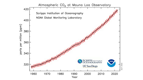
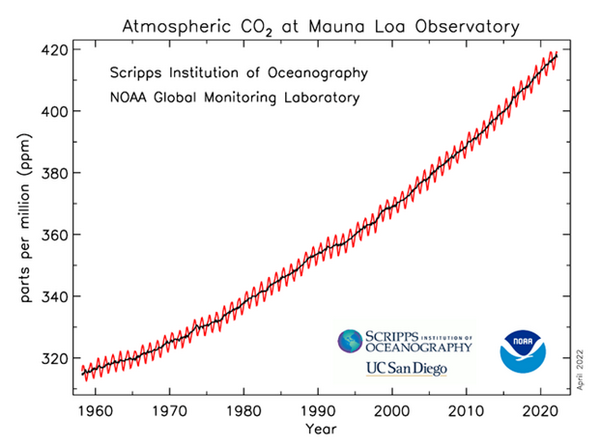
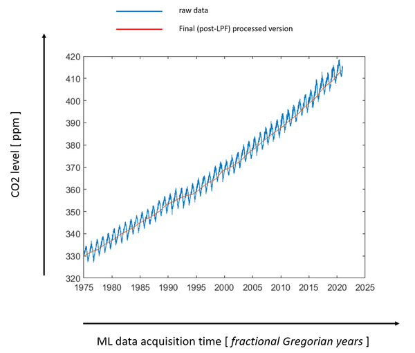
This graph is very commonly seen in climatology literature, websites, textbooks, and mainstream media. It is commonly called the Keeling curve in honor of the founder of the laboratory. It graphs the NOAA-Scripps data for net concentration in atmosphere. This is not human-produced concentration, although many have been allowed to think that it is.
On the left-hand vertical axis is concentration of gas in parts per million of air, or ppm. On the horizontal axis is time marked by dates. The black and red lines indicate the total concentration in air on a given date. The saw-toothed red line plots the results of NOAA’s measurements. The black line is the average of the measurements. The saw-toothed variation is generally accepted to be the measurement of the within year difference in CO2 concentration between northern and southern hemispheres in spring and summer versus fall and winter.
Before we began our study, these saw teeth hinted that the NOAA data from Mauna Loa is sensitive enough to changes in CO2 concentration that could correspond climate events, such as in these red teeth here we was is believed to be seasonal changes in CO2 concentration caused by hemispheric differences in net CO2 concentration caused by planktons and plants receiving more or less sunlight for their photosynthesis.
Next slide.
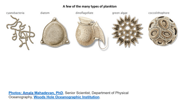
This slide shows some of the types of planktons found in the ocean. Trillions of these tiny creatures are causing the red saw tooth variations in CO2 concentration. They absorb CO2 (or calcium carbonates produced from CO2) and use it to build their physical structure. And they also produce most of Earth’s oxygen as a byproduct. Oxygen is about 21% of dry air, whereas total CO2 is about 0.04% of dry air.
Next slide.
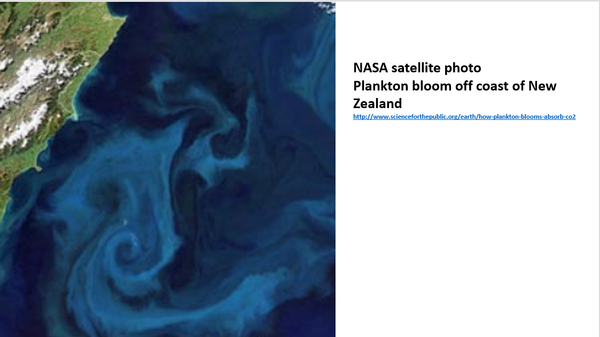
Plankton blooms are variable as shown in this photograph from the International Space Station off the coast of New Zealand. And this is part of the net CO2 concentration and its variations recorded in the Mauna Loa data, the red line in the Keeling curve.
Next slide.
The within year saw teeth are due to seasonal differences in the amount of sunlight reaching earth’s surface.
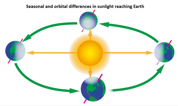
As we see in this illustration, earth’s axis is titled with respect to its orbital plane around the sun. The axis remains tilted at about same angle as the earth travels in its orbit around the sun. (The axis does rotate, or precess, but the cycle is about 25,000 years.) Thus, within a year or one rotation of earth around the sun, northern and southern hemispheres receive different amounts of sunlight at different times in earth’s annual orbit, and this is observed at Mauna Loa as more or less net CO2 concentration. Also, earth’s orbit is not circular. So, in addition to the effect of tilt of the axis, sunlight reaching earth’s surface also varies due to earth’s distance from the sun. Both of these variables affect the within-year red line saw teeth net CO2 concentration by changing the amount of photosynthesis in planktons, trees and all green plants.
Next Slide.
This slide is again the same Keeling curve.

These data in the Mauna Loa Keeling curve also reveal to careful observers two other very important points. First, NOAA-Scripps is reporting here the net residual difference in CO2. It is the difference between net CO2 emissions by all sources natural and human after subtraction of net CO2 absorptions by all sources natural and human. This is the net amount of CO2 that is accumulating in the atmosphere due to all sources minus all sinks.
Next slide:
This slide is from an annual study on earth’s carbon budget authored for each of the last 16 years by about 50 scientists. It shows the meaning of net CO2 concentration which is recorded as the Keeling curve.
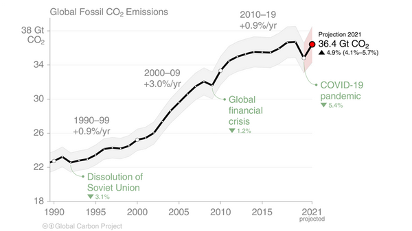
Notice the left-hand vertical axis. POINT. It is CO2 flux, shown as gigatons of CO2 per year. Above the ZERO line is CO2 emissions. Below the ZERO line is CO2 absorptions. If we subtract absorptions from emissions, the result is the Keeling curve. However, in this graph, they want to convince us that the grey area (that is fossil fuel emissions) are causing excess CO2 to accumulate in the atmosphere because absorption (below the ZERO line) is not keeping up with these fossil fuel emissions. The excess or residual fraction is the red dashed line.
However, our study confirms the NOAA Mauna Loa data showing that earth’s environment absorbed in the 2 years following Pinatubo more than all human CO2 emissions, plus the CO2 emissions from Pinatubo itself, plus the CO2 emission from the 1991-1992 El Nino, plus all other CO2 emissions from land use, etc.
Next slide. Again, this is the usual Keeling curve.
Second, as I mentioned, this is curve NOT human CO2. In fact, the net increase of CO2 in the last 40 plus years due to all sources and sinks, all natural and all human sources and sinks, was only 88 ppm total accumulation since the 1974 when daily measurements began at Mauna Loa up to the end of 2020!
Unfortunately, due to the distorted presentation in the commonly shown Keeling curve, the 88 ppm total increase due to nature and humans, is not visible on the graph! The bottom of the vertical Y axis has been removed! The Keeling curve is only showing about 320 ppm to 420 ppm!
The total increase due to all nature and humans for 2019 to 2020 was only 2.5 ppm,
POINT.
That is, NOAA-Scripps Mauna Loa measured only 2.5 ppm net CO2 increase for the year 2020 from all sources and sinks, human and natural.
2.5 ppm is only about 0.6% of net total CO2 at the end of 2020 due to all sources and sinks. In other words, human CO2 cannot exceed 0.6% of the total for 2020, because that 0.6% includes the net increase in CO2 due to all sources and sinks.
In 2007, Dr. Roy Spencer provided graphs which better illustrate CO2 concentration in air.
Next slide.
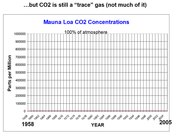
The left-hand vertical axis is still ppm, as is the Keeling curve. But now the range of the left-hand vertical axis is zero to 1 million ppm instead of about 320 to 420 ppm on the Keeling curve.
POINT
The flat line just above the horizontal baseline is net global CO2 from all sources and sinks. The fine red line at the bottom is the same data as the Keeling curve.
Next slide
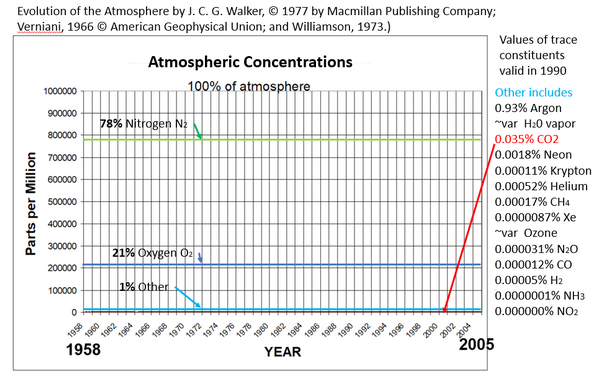
In this graphic, I have added to Dr. Spencer’s graph, in the green line 78% nitrogen which is the amount of nitrogen in air, the dark blue line is 21% which is the amount of oxygen in air, and the light blue line which is the 1% sum total of all of the other gases in air. Dr. Spencer’s red line for CO2 is below the light blue line since it was only 0.035% for 1990.
Maximum possible human CO2 is less than 0.6% of this nearly flat red line near the baseline, because that 0.6% includes the CO2 increase due to all sources and sinks of CO2 both human and natural.
In other words, all this propaganda about human-produced CO2 due to burning fossil fuels, and the loud and fear-loaded claims of climate crisis bemoaned by the UN, governments, academics and banks around the world, Greta, etc. is about an amount of CO2 gas which MUST BE less than 0.6% of the 0.04% of the atmosphere, that is, it must be less than 2.4 ppm for 2020 because that 2.4 ppm includes the increase in CO2 due to all sources and sinks. Human CO2 could not have exceeded 0.00024% of atmosphere for year-end 2020.
CO2 is continuously being emitted and continuously being absorbed, from water everywhere, 24 hours per day, and this would occur if humans, SUVs and factories never existed. The amounts of CO2 both absorbed and emitted are much larger than the net residual difference which is graphed in the Keeling curve. This is an important point in our research.
Next slide.
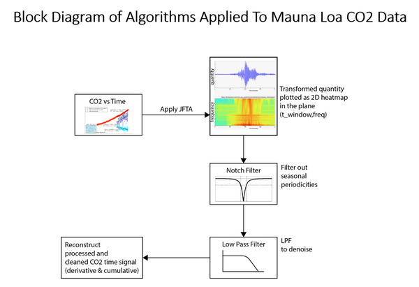
This block diagram summarizes the work process of our scientists in the study.
1. POINT. Our scientists took the raw NOAA Mauna Loa data for daily CO2 tests and filled in data points for days with missing data using standard interpolation methods.
2. Then they transformed the CO2 ppm concentration versus time data into the frequency domain, like a continuous spectrum of light or radio frequencies. This provides nearly unlimited resolution.
3. Then they notch filtered to remove resonances and seasonal cycles such as the shark’s teeth.
4. Then they low pass filtered out all frequencies above a specified frequency to remove random noise spikes.
5. Then they reconstructed the data again as CO2 ppm concentration versus time and cleaned the CO2 time signal.
6. They calculated these data as the time derivative of CO2 concentration. This is the rate of change of CO2 ppm concentration. It is like the speed or velocity of a car.
7. Then they drilled into these data to look at the time window beginning about a year before the Pinatubo volcano eruption of June 15, 1991 and a few years after the eruption.
Next slide
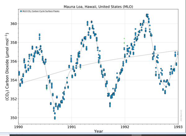
On the left, this slide again is the usual Keeling curve as presented by NOAA-Scripps. On the right is our data after it has been prepared by the method I just described in the block diagram. The time periods on the horizontal axis are slightly different because we only have access to the daily data beginning in May 1974. These two graphs show that our digital signal processing has not severely distorted the data.
Next slide.
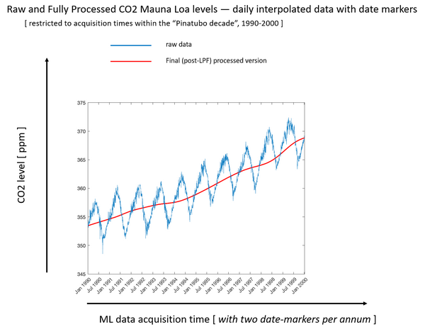
This graph is our data after it has been cleaned as described in the block diagram and then zoomed in to the 10-year period spanning the Pinatubo eruption, January 1990 to January 2000. We can clearly see the seasonal saw teeth (shown in blue now) due to photosynthesis differences between northern and southern hemispheres as discussed a few minutes ago.
Note there is a visible flattening of the red curve, which is the average of the blue saw teeth, after 1991 when the Pinatubo eruption occurred.
POINT
The rate of change (or velocity) of global CO2 concentration slowed after the eruption, and this change is detectable in the CO2 measurements made on Hawaii Island thousands of miles across the Pacific Ocean.
Next slide.
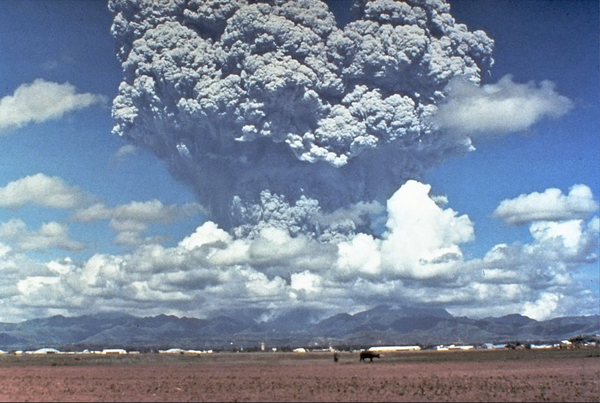
This is a photograph of the Pinatubo eruption. This appears to be a man and a cow in the foreground and in the distance is the U.S. Subic military base which was inundated in ash and mud.
Photo of Pinatubo eruption by Dave Harlowe, USGS. Public domain
Now I will digress again for a moment to explain why we are studying the Pinatubo eruption.
Mt. Pinatubo ejected huge amounts matter into the atmosphere, as we see here, some of it reaching the stratosphere, the layer above the troposphere down at the surface where we all live. This huge amount of matter included gases such as CO2, sulfur gases, and water vapor, as well as ash, aerosols and rock dust. This mass of matter became a cloud belt which encircled the Earth around the equator.
Next Slide.
In this photo taken by astronauts at the Space Station about one and a half months after the Pinatubo eruption, we can see two layers circling the earth above the top of thunderstorm clouds.
POINT TO THUNDERSTORM TOP
These layers reduced the sunlight reaching Earth’s surface, which reduced the temperature of the surface while increasing the temperature of the upper atmosphere.
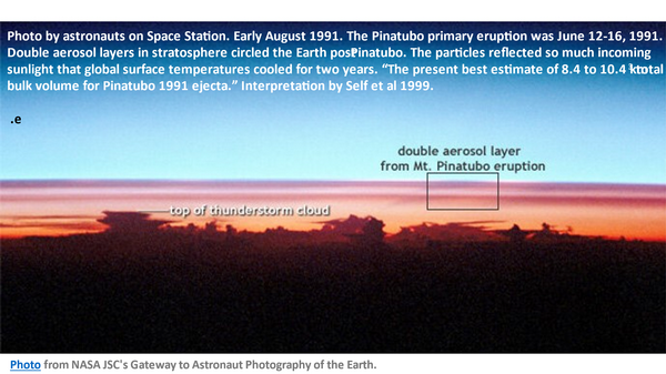
The ash and aerosol layers were so thick that jet airliners were damaged and grounded. The reduction in sunlight reaching the surface resulted in cooling of Earth’s surface for more than a year. Remember that Earth’s surface is more than 70% ocean surface.
Next slide.
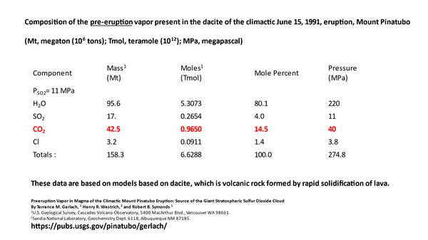
This study of the eruption estimated that about 42.5 million tons of CO2 were added to the air by the Pinatubo eruption itself, as well as 95.6 million tons of water. Despite that addition of CO2, as shown on the graph 3 slides back, the rate of change of net global CO2 concentration slowed, as measured by NOAA/Scripps at Mauna Loa and confirmed by us.
Next slide.
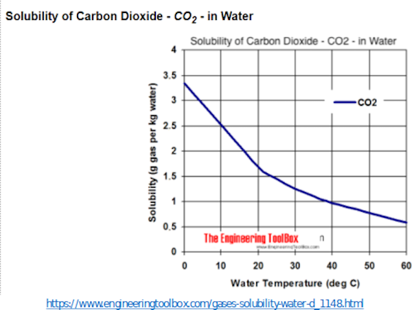
CO2 is highly soluble in water and sea water, as shown in this slide. CO2 solubility is inversely proportional to the temperature of the water’s surface. The solubility of CO2 in ocean surface, that is 70% of earth’s surface, increases as surface temperatures declines as happened after the Pinatubo eruption. Shown here is increasing solubility on the vertical axis POINT and increasing water temperature on the horizontal axis.
Next slide.
In fact, all gases are more soluble in all liquids as temperature of the liquid decreases, and vice versa, as shown here for oxygen in water.

These graphs are readily available online in The Engineering Toolbox. These graphs are not part of our study. This is common information used by chemists and chemical engineers.
https://www.engineeringtoolbox.com/gases-solubility-water-d_1148.html
Next Slide
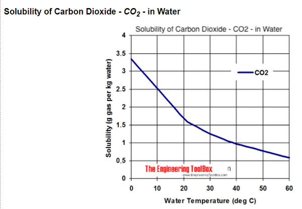
This is the previous slide on CO2 solubility in water. Here we see simply illustrated that the solubility of CO2 gas decreases as temperature increases. This means CO2 gas is emitted from ocean surface as ocean surface temperature increases.
POINT
And Vice versa: CO2 gas is absorbed into ocean surface as ocean surface temperature decreases. This is not a finding of our research, nor is it novel or contentious in any way.
You can easily prove this to yourself by pouring two glasses with the same amount of cold club soda (or beer if you prefer) from the same bottle. Put one glass in a cold refrigerator and one glass at room temperature. Wait an hour and take the glass from the cold refrigerator. Put the two glasses side by side at room temperature. Probably there will no continuing CO2 bubbling from the glass that was left at room temperature, bubbles may be attached to the glass surface. But, as we wait, the club soda in the glass from the refrigerator warms to room temperature, then CO2 bubbles will appear apparently from nowhere in the water, rising to the surface of the water and emitted to the air. Although this example is artificially carbonated soda water, the same process is happening with all water, everywhere. Water absorbs and emits CO2 continuously regardless of temperature. The rate or ratio of emission versus absorption depends mostly on temperature of the water surface.
Geography textbooks have reported for many decades that CO2 concentration in ocean water is 40 to 50 times more than in air. CO2 gas is very soluble in water, and more soluble in cold water than warm. And vice versa.
Next slide
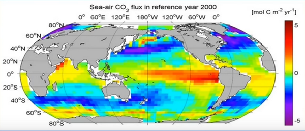
Source: NOAA/PMEL
In this graphic we see the flux of CO2 from sea to air averaged for the year 2000. Flux is the mass or moles of CO2 moving through and area of sea surface in a unit of time. The wide red, yellow and orange zones are mostly tropical ocean surface. As expected, based on the variation in solubility of CO2 due to surface temperature, we see here that CO2 flux is most positively emitting mostly out of warm tropical ocean surface. (POINT) seen in the red yellow and orange. On the other hand, in the colder sea surface of northern and southern latitudes, the flux is negative. The blue and purple is CO2 flux is diffusing into ocean surface.
Now with that background in mind, let’s go back to the previous slide from our study.
Next Slide.

If we look closely at the red line, which is the average of the blue sharks teeth, in the red line in mid-1991 we can see the line is flattening and continues flattening until 1994. POINT. After that the slope of the red line increases.
Next slide
This change in the rate of change of CO2 concentration is seen clearly in this next slide. These are the same data from our study, and the same data as in the previous slide, only zoomed in closer to the time immediately around the June 1991 date of the Pinatubo eruption.
The blue dots are the daily measurements of CO2 by the NOAA-Scripps lab on Mauna Loa volcano here on Hawaii island. The gray line is the average of the blue dots. In the gray line, we can see the rate of increase or slope of the net CO2 concentration in air is flattening, that is the net rate of change in CO2 concentration is slowing after June 1991. POINT This confirms the result we and probably all scientists would expect to occur after the cooling of sea surface due to the Pinatubo cloud belt around the equator.
CO2 emission from warm tropical ocean surface was reduced as surface cooled. Meanwhile CO2 absorption in the northern and southern latitudes increased as this ocean surface cooled there.
Next slide.
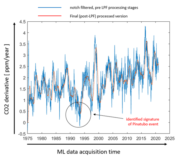
Note the vertical graph axis on the left is now CO2 derivative or ppm/year instead of ppm as in the previous slides.
POINT
We are now looking at the rate of change of CO2 concentration, that is ppm per year, with respect to time rather than ppm with respect to time. These sharp blue lines are relatively large and fast changes in the rate of change of net CO2 concentration. In the circle, we see that the rate of change of concentration per year (that is ppm per year) dropped below zero for a short time. Net CO2 concentration stopped increasing for a short period of time.
Net absorption of CO2 exceeded net emission of CO2 for a period of time. This occurred even though human CO2 emissions were continuing unabated, and even though there was a El Nino event in 1991 – 1992 which are generally recognized to increase CO2 emission from sea surface, and even though the Pinatubo eruption itself was estimated to added over 40 million tons of CO2 to the atmosphere, and even though tropical sea surface and lands were continuing to emit inorganic CO2 as well as organic CO2 from decaying biosphere. There was no reported slowing of human CO2 emissions or slowing of use of fossil fuels after the Pinatubo eruption.
Despite these continuing CO2 emissions, note in the graph that the negative rate of change of CO2 concentration (that is ppm/year) is the reaches the lowest point in the entire measurement record of NOAA’s daily measurements.
This now begs a very intriguing question.
Where did all of this CO2 go?
Next slide.
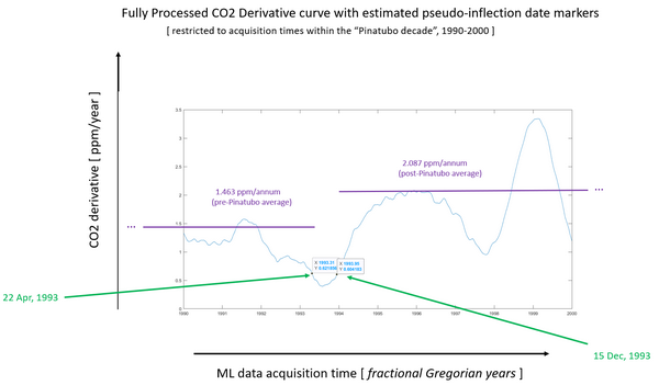
This is the same Mauna Loa data processed in the same way as the previous slide. This again graphs CO2 derivative, that is CO2 ppm per year, on the vertical axis. But we have zoomed in to the 10 years immediately around the 1991 date of the Pinatubo eruption, 1990 to 2000.
The green arrows point to the dates, the x value and y value at the point of maximum deceleration in the CO2 concentration (on the left) and maximum acceleration respectively on the right.
From these two dates, we calculated the 1.463 ppm per year average slope for the entire period 22 April 1993 back to 17 May 1974 when daily records began at MLO, the purple line on the left.
And on the purple line on the right marks the average slope 2.087 ppm per year from 15 December 1993 until the end of the MLO record in 31 December 2020.
Note the vertical gap or difference between the two slopes.
POINT
As of December 15, 1993, about 2.5 years after Pinatubo, CO2 slope was recovering very rapidly. That recovery in rate of change of CO2 concentration continued past the previous slope or 1.463 ppm per year to 2.087 ppm per year, to approximately where the CO2 slope would have been if there had been no Pinatubo eruption.
This begs other intriguing questions. Where did all of that CO2 come from for the recovery in slope? And, why is there an apparent over-recovery in slope, as if the CO2 concentration had a memory or momentum?
These data indicate that there is an enormous sink for CO2 gas and an enormous source for CO2 gas and both are much larger than human CO2 emissions.
Next slide

Is this enormous CO2 flux into and out of the environment confirmed in other records?
POINT TO 1991 ON CURVE
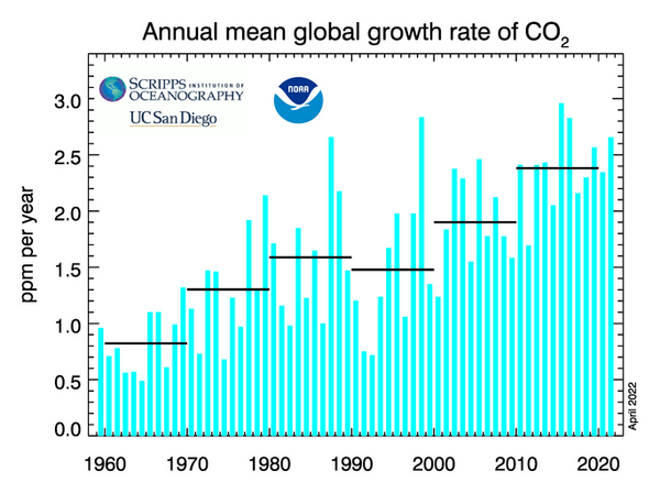
Yes, several studies including the Friedlingstein et al (2019)’s Global Carbon Budget report, which included this graph, and others report large CO2 flux.
Note on this graph that the period from about 1991 to 1994 was the highest recorded net emission flux in entire 80 year period 1960 to 2020.
POINT
Net CO2 emission flux reached about 8 or 9 gigatons CO2 per year and for some months (shown in magenta) was a rate over 10 gigatons CO2 per year. Recall that net CO2 increase for the entire year 2020 was about 2.5 ppm for all sources human and natural, which is about 19.4 gigatons for the entire year 2020. This graph by proponents of human-caused global warming shows CO2 exceeding a positive flux rate of 10 gigatons per year for months in the period around 1992 to 1994, but no negative CO2 flux in the period after June 1991. Friedlingstein et al is only estimating, not measuring, absorption and emission.
Next slide
Our results confirm NOAA-Scripps measured record. Shown in this NOAA-Scripps graph, the rate of change (that is ppm per year) declined precipitously following the Pinatubo eruption in June 1991 and then rapidly recovered to an incrementally faster rate of change than observed before the Pinatubo eruption.
Now for conclusions, theory and discussion.
1. The NOAA-Scripps dataset from Mauna Loa is responsive to CO2 changes even though the event causing those changes is physically remote, thousands of miles away from the NOAA measurement site on Mauna Loa on Hawaii. I expect these NOAA data will be sufficient for further data science. Confirming this was the primary purpose of this first phase of work.
2. Our results confirm that human CO2 emissions are insignificant compared to net global average CO2 concentration. We demonstrate this by simple calculations in our written publication of the results of this Pinatubo study and in 2 addenda.
3. The software and method we used is sensitive to changes in the CO2 daily records from Mauna Loa and well suited for further research.
4. The result of this first phase of our study is consistent with Henry’s Law, the Law of Mass Action, Le Chatelier’s Principle, Graham’s Law and Fick’s Law. CO2 concentrations in air, ocean, soil, and biosphere began to rapidly re-equilibrate to the cooler Earth surface caused by reduced insolation due to the cloud belt. As the cloud belt dissipated and surface warmed, CO2 concentrations rapidly re-equilibrated.
5. Following Henry’s Law, human-produced CO2 can only temporarily change CO2 concentration in air and ocean surface. Our results, confirming NOAA-Scripps results, suggest that human CO2 emissions are a temporary perturbation to an ongoing CO2 trend, like the perturbation caused by Pinatubo but much smaller. Perturbation by human emissions will be rapidly returned to the CO2 trend. CO2 concentration in air is controlled by CO2 solubility in water surface. More than 90% of Earth’s water is in the ocean, and ocean is 70% of earth’s surface.
6. Solubility of any gas in any liquid is an intensive property of matter, like a boiling point, or a specific heat. Intensive properties of matter are not a function of the amount of material present. Instead, solubility and diffusivity of a gas in a liquid are a property of the matter itself, in this case, diffusivity of CO2 is a function of the molecular weight of CO2. Adding more CO2 to the air, whether done by a volcano or by humans, or by decaying biological material, does not change the ratio of CO2 gas concentration in ocean surface versus CO2 gas concentration in air above that surface, this is Henry’s Law. Surface temperature does change that ratio.
7. Solubility or diffusivity of a gas in a liquid depends on the surface temperature and the molecular weight of the gas, not on the amount of the gas or the source of the gas. Diffusivity of a gas in a liquid is inversely proportional to the square root of the molecular weight of the gas; this is Graham’s Law.
8. There are many variables that affect surface temperature, some are systematic like Earth’s orbital distance from the sun, and other variables may be chaotic, such as ocean and air currents, storms, humidity and clouds.
9. We have not studied temperature, but instead we studied only one variable, CO2 concentration, and its variations with respect to time. Thus, we have no result in our study indicating a systematic warming of Earth’s surface is causing an increasing slope of CO2 concentration.
Thank you. I can take questions now.
END
Slide:
1. It is worthwhile to point out that the NOAA data did not detect the sharp reduction in human emissions CO2 when the lockdowns for the corona virus pandemic reduced use of fossil fuels. In fact, CO2 net global atmospheric concentration as measured by NOAA/Scripps Mauna Loa increased slightly during that period. The excuse offered by NOAA and proponents of human-CO2-caused global warming was that reductions in CO2 due to the pandemic will take a long time to be visible in the CO2 data. The data in out Pinatubo study contracts that excuse, showing very rapid changes in CO2 concentration. The reduction in CO2 in the period after Pinatubo and then the increase in CO2 beginning 2 years later were both very rapid, seen in months.
2. Henry’s Law is valid so long as the gas concentration is low concentration in air and in the liquid surface. 400 ppm CO2 and even 4000 ppm is low concentration. Henry’s Law only applies to the specific gas above the surface and to the un-reacted, non-ionized gas in the liquid surface. It is a dynamic phase-state equilibrium reaction with its own kinetics and activation energy. The ratio of CO2 gas dynamically changes with local temperature changes at the gas-liquid interchange surface.
3. Henry’s Law ratio does not apply to gas molecules after they are ionized or reacted with the solvent liquid. In the case of CO2 gas, Henry’s law does not apply to the molecules after they undergo hydrolysis reaction with water ions to become carbonic acid or bicarbonate; those reactions are the first in a series of acid-base reactions. Each reaction has its own kinetics and activation energies. These acid-based reactions and not phase-state reactions. Merging them results in errors.
4. Solubility or diffusivity of a gas in a liquid depends on molecular weight of the gas, not the amount of the gas nor on the source of the gas.
5. Diffusivity of a gas in a liquid is inversely proportional to the square root of the molecular weight of the gas; this is Graham’s Law.
6. Net diffusion flux of a gas into or out of a liquid is determined by the concentration gradient of the CO2 gas, i.e., the difference between the concentration of un-ionized CO2 gas in air on one side of the surface versus the concentration of un-ionized CO2 gas in the ocean surface, and on the surface area and surface thickness through which the un-ionized CO2 gas is diffusing. CO2 gas diffuses from higher concentration to lower concentration until it reaches the Henry’s Law partition ratio (i.e. the Henry coefficient kH) for a specific temperature of the surface. kH is fixed at a given temperature for each gas and liquid combination because the molecular weights and structures of each solute gas and solvent liquid and are different. For example, at the same surface temperature, the kH and diffusivity for O2 gas in sea water is different from CO2 gas in seawater. These Henry’s Law ratios, or coefficients, are conveniently found in chemistry handbooks and online, but they can also be measured and calculated.
7. In local conditions, pH or alkalinity, salinity, and partial pressure of the gas temporarily change the CO2 concentration in the gas phase and in the liquid phase, but the Henry’s ratio is not changed for a given temperature of the surface. These are temporary perturbations. For example, in the estuary of rivers flowing from farmlands or forests into ocean or lakes, the water will seasonally contain relatively more dissolved CO2 from decaying biological material; this river runoff will emit CO2 in the estuary as it merges with the less CO2-saturated ocean until it reaches the Henry’s ratio for the temperature of the ocean surface. Another river may be flowing through rock lands to estuary and into ocean; this river water may leach salts and minerals such as carbonates, borates, phosphates, and silicates from the rocks through which it flows, so salinity of the water is higher than in ocean. (Salinity refers to all dissolved minerals, not only sodium chloride which is always present in sea water.) Solubility of ionized CO2 is inversely proportion to salinity. This mineralized river water will hold relatively less gas than the previous river running through farmland when the two rivers are at the same temperature. The high salinity estuary water will then absorb more gas as it mixes and is diluted with ocean.
8. Ocean, lake and soil surfaces with high winds and water currents will rapidly emit gas, or degas, and become temporarily unsaturated with respect to the Henry’s ratio for a given temperature. When calm conditions return, the Henry’s ratio will be restored for the given surface temperature. gas will be chemically produced in the water surface by reversed reactions, gas will slowly migrated to the unsaturated area, and gas will be absorbed by the surface in excess to emission, until the Henry’s ratio is restored for the given temperature. These temporary perturbations generally offset each other and cancel out. There are high winds in one place and calm in another.